Paint Race: When I Added a Computer Opponent, Everything Changed
Paint Race started as a simple doodling toy. You move a cursor around a canvas and it leaves a trail of neon blue paint behind it. I spent an afternoon on it and showed it to a few people. Their reaction was uniformly polite but unenthused. "Cool, so you just paint?" Yeah. That's it. No stakes, no opposition, no reason to cover the canvas faster. Adding the red AI opponent was a last-minute decision that I almost didn't make — and it transformed the experience entirely.
Designing an AI That Feels Threatening but Beatable
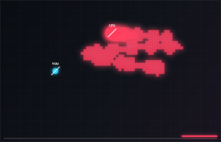
My first AI implementation was a simple greedy algorithm: at each step, move toward the largest unpainted cluster visible from the current position. It was devastatingly efficient and not fun to play against. It would carve out the canvas in optimal sweeping passes and players would look up to find 60% of the canvas already red before they'd even covered a corner. The problem wasn't difficulty — it was that a perfectly optimal AI communicates nothing interesting. It just wins. I introduced deliberate imperfection: the AI targets the largest open cluster with 70% probability and makes a random adjacent move the other 30% of the time. I also gave it a speed cap slightly below the player's maximum speed. These constraints made the AI feel alive — it made mistakes, it could be outrun, it occasionally made a weird choice — without ever feeling incompetent. Players started making strategic decisions: cover the center early, cut off the AI's path, sprint to claim a corner. None of that emerged without an opponent to play against.
The Color Language and Why Blue vs Red Was the Right Choice
I experimented with other color pairings — green vs orange, purple vs yellow — but blue versus red had an immediate readability that the others didn't. On the dark canvas background, neon blue reads as "player" and red reads as "threat" almost instinctively. I didn't need to explain which was which in any tutorial text because the color language carried it. The saturation levels mattered too: I made the player's blue a bright, almost electric cyan while the AI's red was a deeper crimson. This meant the player's territory always felt like it was glowing on the screen, which made covering more canvas feel intrinsically rewarding independent of score. Territory you can see clearly is territory you feel ownership over. That ownership feeling is what makes a territory control game emotionally work, so getting the color balance right was more important than any other visual decision in the whole project.
Measuring Who's Winning and Making It Legible
Early builds showed the score as a raw pixel count — "You: 18,432 | AI: 21,048." Nobody could parse that. I switched to a live percentage bar at the bottom of the canvas: a horizontal strip that showed the blue-to-red coverage split in real time. The moment I added it, the game became dramatically more readable. Players glanced at the bar, saw they were at 44%, and immediately understood both where they stood and what they needed to do. The bar also made comebacks visible — watching the blue section slowly widen as you outpaint the AI in the final moments creates a tension that a number counter simply can't. I also added a gentle pulse animation to whichever color was currently winning, which helped players stay oriented during frantic sessions without having to consciously read numbers. Communicating game state through shape and motion, not just text, is a lesson I'll keep coming back to.
Browse All Games